




BJJ T-shirt, Team, white
24,90€
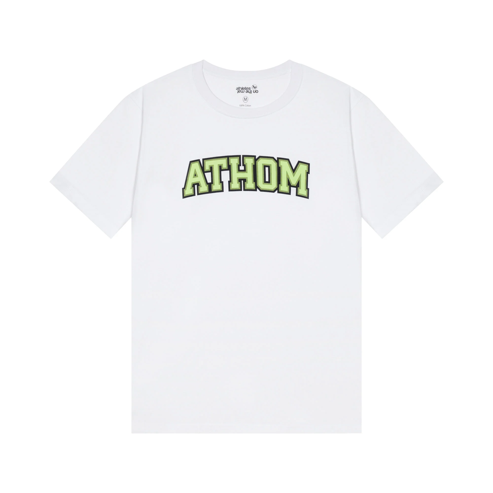
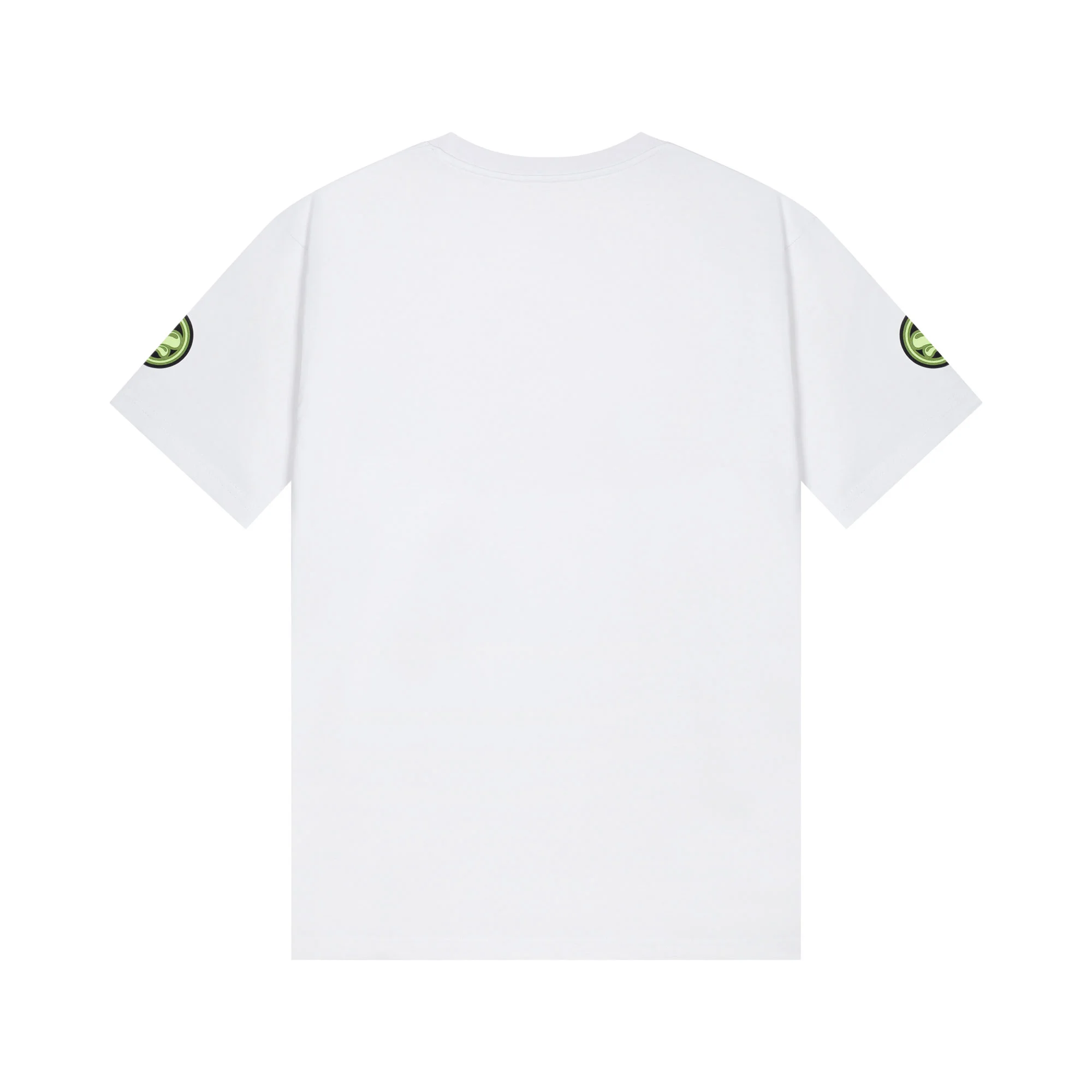
BJJ t-shirt Team white, varsity lettering. The word ATHOM runs across the chest in arched capitals, drawn the way an American university writes its name. A round patch carries the brand emblem on each sleeve. The back is left plain.
Specifications
- Fabric weight
- 180 GRS
- Available sizes
- L, M, S, XL, XXL
- Manufacturing
- Made in China
Varsity lettering
This style of lettering has a name and a precise origin. It is called varsity, after the word for a university’s first team. The characters are heavy, with short serifs, and the word arches above the chest to follow the line of the shoulders. It is the lettering of college sports jackets, cut in felt and stitched on since the 1930s.
What it announces is not a brand, it is a membership. On a campus jacket, the arched word is the name of the school, and the patches on the sleeves name the sport and the year. The grammar is the grammar of a team.
A team in an individual sport
Brazilian jiu-jitsu is practised alone against an opponent, but nobody improves alone. You belong to an academy, you wear its patch on your gi, you travel to competitions with the same faces, and you owe your progress to specific training partners.
The Team model borrows the codes of team sport for a sport that is not one. That is what the arch across the chest and the two sleeve patches are saying: a team jersey for a discipline where the team exists without ever stepping onto the mat with you.
The white one, in practice
On white, the letters are almond green with a black outline. That outline is not decoration. Pale green laid straight onto white would lose its edges: the two values sit too close together, the eye stops finding the boundary and the word blurs from three metres away. The black line detaches the letter from the ground and keeps the word readable at distance. Printers call it a keyline, and it is what holds the design together.
This is the version closest to the original code. The American campus tee is white in the overwhelming majority of cases, and the pale green reads as a team colour rather than a fashion shade.
On and around the mats, white has an obvious use: it is the common colour. If your academy orders shirts for a camp or a trip, this is the one everyone agrees on, and the one a group photo stays readable on. It is also the only one that clashes with no gi.
One thing to watch: the black outline is the part of the design that shows wear first. A fine line takes friction less well than a solid area. Wash inside out and keep the iron away from the print, and the word will hold its edges.
The cut
Shoulder seams on the shoulder, sleeve to mid-bicep, straight drop from chest to hip. Nothing fitted, nothing floating. An arched print assumes the shirt hangs straight: worn too tight, the word distorts across the chest.
Take your usual size. If you are unsure, go up rather than down, since the cotton shrinks mostly in length on the first wash.
How we check these reviews. The reviews published on this page come from customers invited by email after their order. Every review is checked manually before publication. Reviews are sorted from newest to oldest by default; you can change this order. We never alter the content of a review. Read our review publication rules.
 BJJ T-shirt, Team, white
Complete your kit

You might also like


Reviews
There are no reviews yet